|
<< Click to Display Table of Contents >> Comparison Reports |
  
|
|
<< Click to Display Table of Contents >> Comparison Reports |
|
Comparison Reports display a list of values with calculated totals for each item.
There are dedicated comparison reports for Sites, Checklists, Month (Monthly Trends), Time of Day, Day of Week and all other User-Defined Variables.
Comparison Table
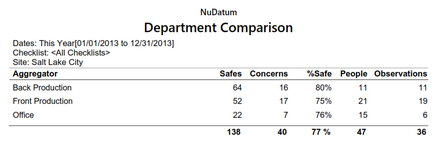
The example above is a Comparison Table report for the user-defined variable "Department".
The Comparison Table report displays the number of Safes, Concerns, Percent Safe, People, and Observations of each item.
| • | The number of Safes, Concerns, and People are simple totals from all observation records that match the filter criteria. |
| • | The Percent Safe is calculated by dividing the number of Safes by the sum of the Safes and Concerns. |
| • | The Observations are the count of all observation records that match the filter criteria. |
Comparison Chart
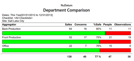
The example above is a Comparison Chart for the user-defined variable "Department".
The Comparison Chart the same data as the Table but includes a graphical representation of the Percent Safe.
Comparison Report Excel Export
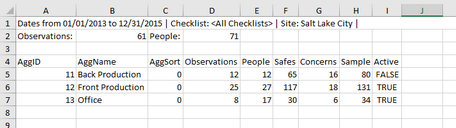
An example of an Excel Comparison Report. Users can easily generate other types of charts or integrate the data into other systems with this format.